
Rotated Images with CSS3
by Bandicoot Marketing on | Posted in Tutorials | 13 comments
I have been playing around with a lot of CSS3 lately due to PressWork, and I’ve come up with some cool tricks. One that I really like uses the transform style to create a rotated image. If you surround it with a div container and mask the outer edges, you get a pretty awesome effect.
Let’s take a look at the HTML required:
<div class="image-box">
   <img src="http://your-site/images/your-image.jpg" alt="" width="300" height="200" />
</div>
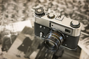
That is pretty straightforward enough and it gives us something like this:
We need some CSS to get it looking how we want:
.image-box img {
   transform: rotate(15deg);
   -moz-transform: rotate(15deg);
   -webkit-transform: rotate(15deg);
   }
That gives us:
Not exactly what we want, but we’re getting there.
Let’s crop the div container to mask out the image’s edges:
.image-box {
   width: 200px;
   height: 150px;
   overflow: hidden;
   }
Our image now looks like this:
We need to center it within the div container and that requires a few modifications to the CSS:
.image-box {
   width: 200px;
   height: 150px;
   overflow: hidden;
   position: relative;
   }

.image-box img {
   transform: rotate(15deg);
   -moz-transform: rotate(15deg);
   -webkit-transform: rotate(15deg);
   position: absolute;
   left: 50%;
   top: 50%;
   margin: -100px 0 0 -150px;
   }
That’s exactly what we want. It might look a little plain but now that you have the basic idea, you can add some more CSS to make it look even better:
.image-box {
   width: 200px;
   height: 150px;
   overflow: hidden;
   position: relative;
   border: 5px solid #eee;
   box-shadow: 0 0 1px rgba(0,0,0,0.3);
   -moz-box-shadow: 0 0 1px rgba(0,0,0,0.3);
   -webkit-box-shadow: 0 0 1px rgba(0,0,0,0.3);
   }

.image-box img {
   transform: rotate(15deg);
   -moz-transform: rotate(15deg);
   -webkit-transform: rotate(15deg);
   position: absolute;
   left: 50%;
   top: 50%;
   margin: -100px 0 0 -150px;
   }
With CSS3 you no longer need to rely on something like Photoshop to get certain effects on your images. All it takes is a few lines of CSS3.
13 comments for “Rotated Images with CSS3”