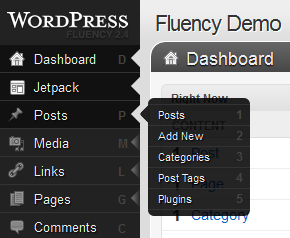
Fluency Admin For WordPress
by Bandicoot Marketing on | Posted in Articles | 6 comments
Today I’m going to talk about one of my very favorite plugins, Fluency Admin.
A couple of years ago, I came across a competition to tweak the design of the WordPress administration pages. I have a few pet peeves about it myself:
- Grey, grey and more grey; too much grey everywhere (on a default install)
- The need to click on the top menu item to expand the menu section (such as Tools or Settings)
I know that you can shrink the menu by clicking on the little arrows located between certain menu sections, but all that leaves us with is the little icons, and even more bland light-grey. So, in that competition, one submission struck me as being a marked improvement to the standard design: Fluency Admin by Dean Robinson.
What do I like about it?
- If you hover over the menu items, the submenu items appear in a semi-transparent flyout that I find attractive
- Hotkeys for quick menu item access
- iPad ‘friendly’ menus
- You can completely hide the left-side menu and use only the admin bar at the top, with drop-down menus
You also get a few more options to customize things for yourself, if you’re a real tweaker (or maybe for a client):
- You can change the logo that appears above the left-hand menu (the WordPress logo in the screenshot above)
- Integrated login screen logo changes (no need for yet another plugin or for custom code)
- Easy removal of the little icons on each menu item
- You can even change the color of the Fluency menu (although dark colors work best)
I feel that Fluency gives the admin pages a much more modern look. It’s the first thing I install on a new WordPress installation. Give it a try yourself!


6 comments for “Fluency Admin For WordPress”